Navigation Redesign
Overview
Restructure a complex product's Information Architecture for cohesion, and to support future product expansions.
Role
UX Research / UX Design / UI Design / HTML/CSS
Duration
8 weeks
The problem
Users are experiencing significant friction in their daily workflows due to a fragmented and complex navigation structure that evolved organically over a decade of feature additions.
The current navigation requires excessive clicking back and forth between sections, and lacks a coherent information architecture that aligns with how users actually work. This complexity frustrates experienced users but also creates a steep learning curve for new users, hindering product adoption and extending the time required for users to become proficient.
The goal
Redesign the navigation to create an intuitive, streamlined information architecture that reduces navigation steps, surfaces workflow-relevant links contextually, and creates a more learnable structure for new users.
The redesigned navigation should accommodate the product's full feature set while significantly improving findability, reducing onboarding time, and increasing both new user confidence and experienced user productivity.
The impact
- Reduced average clicks from 3 to 1 to reach key features
- Customer support reported a significant decrease in navigation-related tickets
- Established scalable navigation framework that can accommodate future feature additions without increasing complexity
Understanding the user
To ground the redesign in real user needs, I analysed data from multiple user interviews alongside a review of support tickets, providing both qualitative insight into user frustration and quantitative signal around recurring pain points.
The primary users are technical professionals operating in fast-paced environments where speed and efficiency are critical. They rely on the product to access specific features quickly, with minimal friction. Time spent navigating the interface rather than completing tasks directly impacts their workflow and productivity.
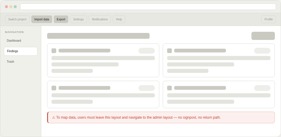
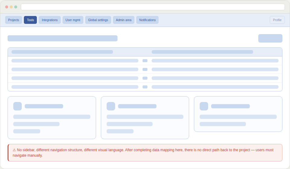
The interview data and support tickets pointed to a consistent and clearly defined problem: the existing navigation structure was working against users rather than for them. The product had two distinct layouts that users were forced to switch between depending on the task at hand.
This created a disorienting back-and-forth experience, that was particularly problematic for users who needed to move quickly between features. Rather than feeling like a cohesive tool, the interface felt fragmented.
Compounding this, the primary features were housed in a sidebar that required significant scrolling to navigate. For experienced users who knew exactly what they needed, this added unnecessary steps to every interaction and slowed down even routine tasks.
Key pain points
- Dual-layout structure created context switching and disorientation
- Core features were buried behind excessive scrolling in the sidebar
- Navigation overhead slowed down task completion for time-pressured users
- Support ticket volume indicated the issues were widespread, not edge cases
Design implication
Users didn't need more features. They needed faster, more predictable access to the ones they already relied on. The navigation structure needed to reflect how users actually work: with focus, speed, and a clear mental model of where things are.
Ideation
With a clear understanding of the users' needs and pain points, I began exploring how to restructure the navigation to better support their workflows rather than simply reflecting the product's technical architecture.
The first step was to define the core workflows for the main user types. I mapped out the typical engagement lifecycle and identified which features were critical at each stage. This workflow mapping revealed that users didn't think about the product in terms of individual features, but rather in terms of the tasks they needed to accomplish.
Rather than trying to reorganize the existing navigation structure, I took a more foundational approach: I broke down every feature and function into individual components, essentially starting from scratch. This deconstruction allowed me to step back from how things had always been organized and look at the product with fresh eyes.
Once I had all the pieces laid out, I began regrouping them into categories based on workflow affinity—features that users would need at the same time or for the same purpose belonged together.
This exercise surfaced several insights:
- Features grouped by technical backend didn't align with user mental models
- Certain features served multiple workflows and needed to be easily accessible from different contexts
- Different user types sometimes needed access to the same information but with different perspectives
As I examined the regrouped categories, a pattern emerged: some categories represented major workflow phases or user goals, while others were supporting functions or detailed views within those larger contexts.
This insight led to the core structural decision: a two-tier navigation system with a main navigation bar for primary workflows and a contextual sub-navigation bar that would appear for features requiring deeper categorization.
This approach would:
- Keep the main navigation clean and focused on major user goals
- Provide contextual depth without overwhelming users with choices
- Allow experienced users to navigate quickly while helping new users understand the product's structure
- Scale to accommodate the product's complexity without creating cognitive overload
Project takeaways
Results
Over eight weeks, we transformed a decade-old navigation structure into a streamlined, workflow-based system.
The new IA minimized navigation friction by reducing clicks to frequently accessed features, while simultaneously making the product more approachable for new users and more efficient for experienced ones.
Lessons learned
The biggest lesson? Making something feel simple and intuitive takes significant effort. Our team went through numerous iterations, healthy debates, and testing cycles to achieve our goals.
But the real breakthrough came when I approached the problem with beginner's mind. Deconstructing the navigation into fundamental building blocks allowed me to see patterns and solutions that weren't visible within the existing structure.